Brand kit
How to represent MBER: the mark, the palette, the type system, and the voice. The brand runs on one idea, ember amber over near-black, and the product is built the same way. When in doubt, match what you see in the app.
The mark
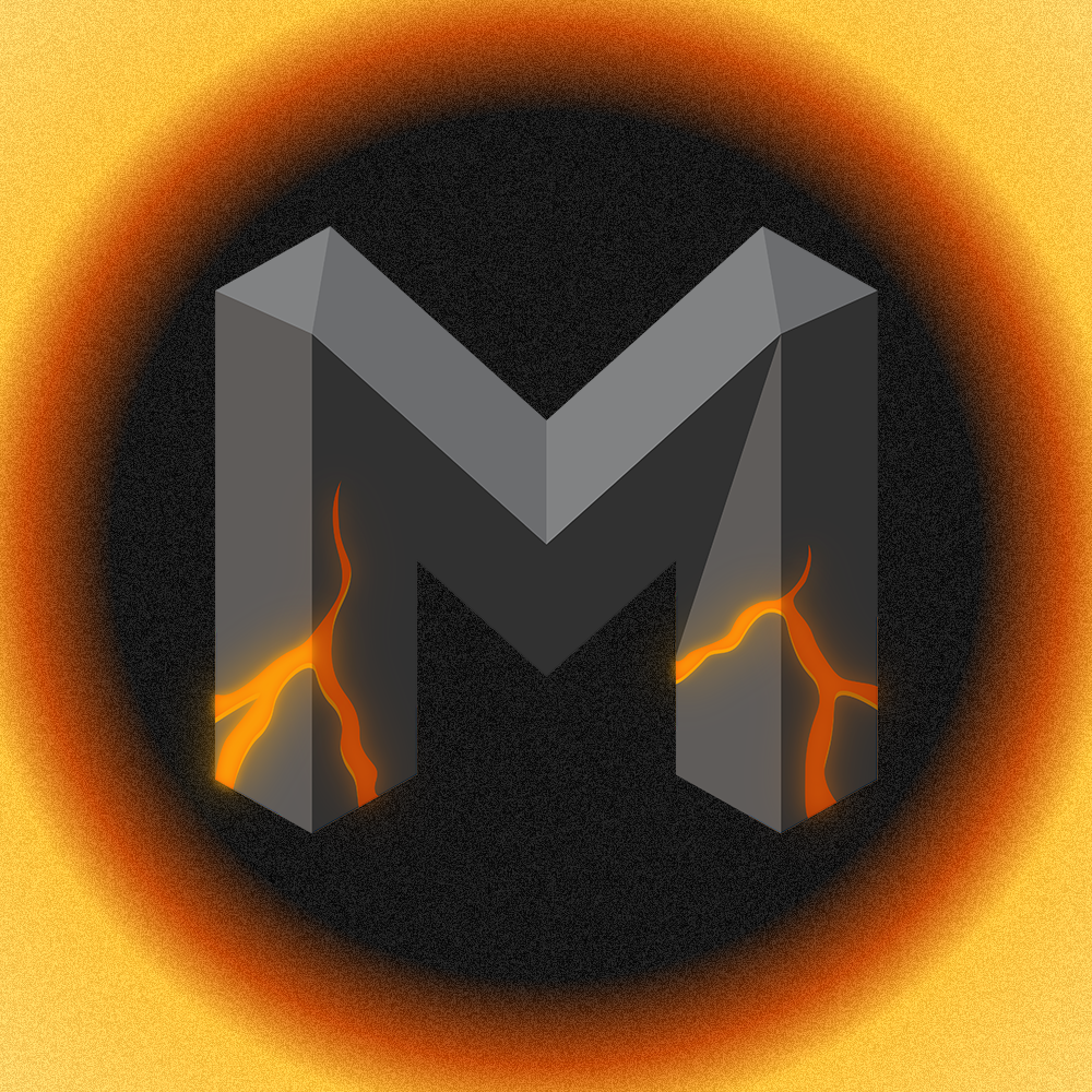
The logo is the glowing M: a slab letterform with an amber ember burning at its base. It sits above the ignite your content lockup. The same mark works on light and dark; only the lockup accent shifts with the surface.

- Pair the glowing M with the ignite your content lockup.
- Keep clear space of at least one M-height on every side.
- Hold a minimum mark size around 24px so the ember stays legible.
- Recolor the mark or remove the amber ember.
- Stretch, rotate, or add extra shadows and outlines.
- Place it on busy or low-contrast backgrounds.
Wordmark
The name is written MBER in all caps. The token is written $MBER. Keep both
intact: no spaces, no lowercase, and never separate the $ from the token.
Color
Amber over near-black is the whole identity. The dark theme leads; the light theme swaps to a deeper orange so the accent keeps its weight on white.
Dark theme
Light theme
For charts and depth, amber extends into a ramp (#FBBF24 through #92400E on dark,
#DC691E through #FAD8BE on light). Text on an amber fill is always near-black.
Typography
Three families do all the work, mirroring the app exactly.
Voice
Direct and sharp, never hype for its own sake. MBER helps people cut noise, so the writing should too. Short lines, a clear contrast, the accent on the turn:
X is loud. Meet your focused timeline.
Turn the firehose into signal.
Stop doom scrolling. Start creating.
In the product
The brand is most of all a set of habits in the UI:
On hero and landing surfaces the main action is an amber outline, not a solid fill. A quiet mono-caps link sits beside it as the secondary path.
Muted fill, foreground text. For low-emphasis actions next to a primary.
Mono, bold, uppercase, wide tracking. Amber when active, with no box fills or left bars.
Turn the firehose into signal. Your focused timeline, scored and ranked, so the work that matters surfaces first.
Cards are rounded with a soft border on the card surface. Amber is reserved for the score and the signal, not the whole panel.
See it live on the Timeline and Stories.
Logo book
Every approved form of the mark in one place. Each tile previews the asset; the link under it downloads the file. Pick the variant that fits the surface, and never redraw the logo when one of these will do.


Want the full guidelines as slides? Open the full brand deck, ready to print or save to PDF.
Give the mark room to breathe, keep the palette honest, and let the amber do the talking.